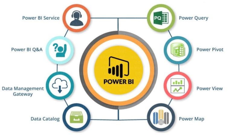
Power BI training workshop is an enterprise business intelligence platform that lets you easily connect to data and create visualizations. It also lets you build effective reports and dashboards.
Learn how to use Power BI to make strategic information available across your organization. You will get hands-on experience using the Power BI toolset including Power Query, Power Pivot, and Power View.
Introduction to Power BI
Whether your data is stored in an Excel file, CSV file, or a collection of cloud and on-premises data warehouses, Power BI allows you to connect, transform, model and visualize it to generate actionable insights. The platform features an intuitive user interface, a powerful ecosystem of data modeling tools, and outside-the-box visualizations. Learn how to use Power BI to create insightful dashboards and reports that can be shared across the organization.
Power BI is self-service business intelligence software that can be used by any member of the organization without needing IT support or an advanced degree in data analytics. It uses an intuitive natural language interface and provides simple graphic designer tools to make it easy to create dashboards and reports that can be viewed anywhere.
In addition to the ability to create visualizations and reports, Power BI also includes an array of other features such as:
Power BI’s built-in data connectors allow you to connect to more than 300+ different sources. Using these connectors, you can extract data from a variety of source systems such as Excel workbooks, SQL databases, Facebook, Twitter, Salesforce, and MailChimp. These datasets can then be combined to create a single dashboard that includes multiple types of visuals.
Data Modeling
The Power BI toolset includes powerful data modeling features to help you create a logical, efficient database structure. This can improve query performance and reduce data redundancy. It can also facilitate communication and governance between teams and stakeholders. To model your data, start with a clear understanding of business requirements. Then, identify entities and their attributes in the data set. Then, use this information to create a draft entity-relationship model. Finally, finalize your model and validate it for accuracy.
Once you have a model, you can begin to explore the possibilities of Power BI. You will discover how to use Power BI’s Data, Model, and Report views. You will learn how to load multiple datasets in Data view, build a data model to understand relationships in Model view, and create your first bar graph or interactive map visualization in Report view. You will also learn how to manipulate and transform data using Power Query Editor. This will include applying table transformations, column transformations, and custom functions. This will give you a deeper understanding of Power Query and its unique features, such as DAX.
You will then learn how to leverage Power BI’s built-in visuals to make better decisions. You will also learn how to create your own visuals in the Power BI desktop application, and how to deploy them to the Power BI website or to SharePoint on-premises.
Visualizations
Visualizations are the heart of Power BI, providing powerful and engaging ways to explore and communicate data. They are important because they help the user understand and make sense of complex data by making it more accessible and intuitive. Power BI has a variety of default visualizations and offers an extensive library of custom visualizations. It also allows users to upload their own custom visualizations.
Power BI provides numerous ways to present your data, and the type of visual you select depends on what you need to communicate. For example, comparison visuals compare data between different categories. Correlation visuals help identify relationships between two variables. Distribution visuals show the relative frequency of values in a dataset. And part-to-whole visuals breakdown a large dataset into individual parts that add up to a whole.
In addition to creating visualizations, you can use Power BI’s Get Data feature to connect to and transform any data source. You can then add the data to a report or dashboard, which are collections of visualizations that are related to one another. You can even pin visualizations to a dashboard for sharing or embed them in websites. You can also edit a visualization by adding or removing columns. You can also modify data colors and apply other formatting to the visualization. You can also add static text, images, and shapes to your visualizations.
DAX
DAX is the data modeling expression language used by Power BI (and also SSAS Tabular and Power Pivot). This two-day training covers all aspects of DAX from Zero to Hero. You will learn about the different aggregation functions, iterators, and filter functions in detail. Also, you will be introduced to DAX Studio which is an advanced tool for writing and running DAX queries. This tool also allows you to optimize the performance of your model. You will learn how to use the Query Builder and other features of DAX Studio to build and run complex expressions.
The training also includes a detailed discussion of Power BI Visualizations and their best practices. You will learn how to create effective charts and visuals, as well as how to create and use a matrix. Finally, you will learn how to design mobile reports and change the interactivity of your visualizations.
Before Power BI, many of these transformations would have been done in the database with sophisticated queries and logic. Now, with Power BI and DAX, they can be done in the front end with more ease and efficiency. This frees up the data engineer and DBA’s time for more important work, which ultimately makes a business more agile and competitive. The architecture blueprints of Power BI will be covered in this section as well.