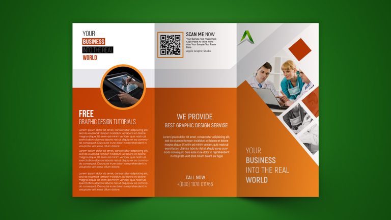
The Essence of Brochure Design
Brochures remain a powerful tool for communication, despite the digital shift in marketing. A well-designed brochure offers a tangible, personal connection with your audience, making it an essential part of any marketing strategy. The essence of brochure design lies in its ability to convey a brand’s message succinctly while maintaining visual appeal. It must strike a balance between aesthetics and information, ensuring that the design captures attention and the content communicates effectively.
Elements of Effective Brochure Design
Creating an effective brochure begins with understanding the elements that contribute to its success. The layout, typography, color scheme, and imagery must all work together to create a cohesive design. The layout should guide the reader’s eye through the content seamlessly, while typography should be both legible and reflective of the brand’s personality. The color scheme should evoke the right emotions and align with the brand’s identity. Imagery, whether photographs or illustrations, should complement the content and enhance the overall message.
The Importance of a Clear Message
A brochure’s primary purpose is to communicate a message clearly and concisely. This requires a deep understanding of the target audience and the key points that need to be conveyed. The content should be organized in a way that is easy to follow, with headlines and subheadings breaking up the text to avoid overwhelming the reader. It’s essential to avoid cluttering the brochure with too much information; instead, focus on the most important details that will resonate with the audience.
Balancing Creativity and Professionalism
Brochure design is an art that requires a balance between creativity and professionalism. While it’s important to create a visually appealing design, it’s equally crucial to maintain a level of professionalism that reflects the brand’s values. This means avoiding overly flashy designs that could distract from the message, and instead opting for a design that is both creative and sophisticated. The brochure should leave a lasting impression on the reader, showcasing the brand in the best possible light.
The Role of Call-to-Action in Brochure Design
An effective brochure not only informs but also encourages the reader to take action. This is where a strong call-to-action (CTA) comes into play. Whether it’s prompting the reader to visit a website, make a purchase, or contact the company, the CTA should be clear and compelling. It should stand out in the design, using contrasting colors or bold typography to draw attention. The CTA is the final step in the brochure’s journey, turning interest into action.